How to Make Video Thumbnails That Get More Clicks

Why Your Video Thumbnail Matters More Than You Think
Nobody reads the title first. That's just the truth.
Before your title, before your channel name, before anything, there's that little rectangular image sitting there, doing all the heavy lifting. Your thumbnail. And in most cases, it gets judged in under a second. Blink, scroll, gone.
The frustrating part? Most creators pour hours into recording and editing, and then spend four minutes slapping together a thumbnail. Then they're baffled when the views don't come. It's not always the algorithm. Sometimes it's just the image.
This guide is for people who want to stop guessing and start thinking about thumbnails the way a viewer actually does — fast, visual, instinctive. We'll cover what works, what doesn't, and how to build a real approach that holds up across platforms.
What a Thumbnail Is Actually Doing
Think about the last time you opened YouTube with nothing specific in mind. You're scrolling. You're not reading titles carefully you're scanning images. Something catches your eye, you pause, maybe glance at the title, and decide.
That pause? That's your thumbnail doing its job.
It's not decoration. It's a decision-trigger. And it has to answer one question, fast: is this worth my time?
The answer is communicated through color, expression, contrast, and framing. Not through paragraphs. Not even through words, most of the time. Your thumbnail is a visual argument. And it has about half a second to make it.
Read also: Best Video Converter Settings for Faster Website Loading Speed
The Real Reason Most Thumbnails Fail
Here's something worth sitting with: a bad thumbnail doesn't just get ignored, it quietly signals something negative about your content. It says "this creator didn't try very hard." Even if your video is genuinely good, a weak thumbnail implies otherwise.
And the reverse is also true. A sharp, intentional thumbnail signals quality before anyone hits play. It creates an expectation. That expectation shapes how the viewer experiences the video itself.
Most thumbnails fail for a handful of reasons that keep showing up again and again:
- They're too busy. Three different fonts, a logo, two images, and a subtitle. The eye doesn't know where to go first, so it goes nowhere.
- They disappear into the feed. Light backgrounds on a light-background platform. Muted colors that blend right in. A thumbnail that doesn't contrast with its environment is invisible.
- They use a random screenshot. Unless you captured something genuinely striking mid-video, a raw frame almost never works. Most video screenshots are soft-lit, awkwardly composed, and unremarkable. They communicate nothing.
- They mean something to the creator but nothing to a stranger. Inside jokes, vague references, text that makes sense only after you've already watched — none of this helps a cold viewer decide to click.
- They don't match the video. Clickbait thumbnails might spike your impressions. But when people click and get something different from what the image promised, they leave. Fast. And that early exit hurts your channel longer term than the initial click helps.
What Actually Grabs Attention on a Screen
Let's talk about what the eye actually responds to, because this is where design meets psychology, and it's more practical than it sounds.
Contrast Does the Heavy Lifting
The single biggest predictor of whether a thumbnail stands out is contrast. Specifically: how much does your foreground subject stand out from the background, and how much does the whole image stand out from the platform around it?
YouTube's interface is mostly white and grey. If your thumbnail is pastel, light-toned, or softly lit, it vanishes. A dark, punchy thumbnail surrounded by bright ones will pop. A bright, saturated thumbnail surrounded by dark ones will pop. It's all relative. Scroll through your niche and look at the feed. Whatever everyone else is doing, you need to be visually different from it.
Faces and Expressions Are Magnetic
This sounds basic, but it keeps being true: human faces draw the eye. Our brains are literally wired to find and focus on faces in our visual field, it's one of the first things we learn as infants. That instinct doesn't turn off when we open YouTube.
More specifically: expressive faces. Not a neutral look-at-the-camera shot. A genuine reaction, surprise, disbelief, delight, concern. Something that implies there's a story here worth knowing.
You don't have to pull ridiculous faces to make this work. But a flat, expressionless headshot is leaving a lot of attention on the table.
Text That's Actually Readable
Add text to your thumbnail, sure. But run this test first: shrink your thumbnail down to the size of a coin. Can you still read it? If not, start over with something bolder.
Thumbnail text needs to be large, heavy, and high-contrast. Thin fonts don't survive small sizes. Fancy scripts that look great at full resolution turn into mush at thumbnail size. Stick to thick, bold fonts. Keep it short, five words is usually plenty, and three is often better. Drop a shadow or outline behind the text if the background makes it hard to read.
And one thing worth saying plainly: your thumbnail text and your video title don't have to say the same thing. In fact, they shouldn't. The title can complete what the thumbnail started. Together, they create a fuller picture. Separately, they each do half the work.
Color With Intention
You don't need to study color theory to make better thumbnails. But you should be deliberate about what your palette communicates.
Red tends to read as urgent, intense, alarming. Yellow is warm, energetic, optimistic. Blue reads as calm, trustworthy, credible. Orange sits somewhere between red and yellow, approachable and action-forward. Green suggests growth, nature, positivity.
None of this is a hard rule. But it's a useful filter. If you're making a tutorial about something stressful, money, career, health, a palette that feels calm and credible probably serves you better than one that feels chaotic and loud.
Pick your channel colors and stay consistent. Over time, viewers start recognizing your thumbnails before they even read your name. That's brand recognition. It takes consistency to build, but it compounds.
How to Actually Build a Good Thumbnail
Theory is useful. Application is better. Here's how to go from blank canvas to something worth clicking.
Start with the right file setup. Standard thumbnail dimensions are 1280 x 720 pixels, that's the 16:9 ratio that works across YouTube, LinkedIn, and most platforms. Work at full resolution and export to JPEG or PNG, keeping file size under 2MB. Don't design small and scale up; you'll lose sharpness where you need it most.
Establish your background first. Your background sets the visual stage for everything else. It can be a blurred scene from your video, a solid color, a gradient, or a custom graphic. Whatever you choose, it needs to support your foreground — not compete with it. A busy background behind a busy subject is a recipe for confusion.
Place your subject with intention. If you're cutting out a person, use a clean removal and position them slightly off-center. Faces or subjects that look toward the text create a natural visual flow, the eye follows the subject's gaze. Straight-on, dead-center compositions tend to feel static.
Write your text like a hook, not a headline. The goal isn't to explain the video, it's to create just enough intrigue that the viewer wants to know more. "This Broke My Business" works better than "How I Made a Mistake That Cost Me Revenue." Shorter, more provocative, more emotionally charged.
Step back before you finalize. Literally look at it small. Look at it next to other thumbnails in your niche. Ask someone who hasn't seen it what they'd expect the video to be about. If their answer aligns with reality, you're on the right track.
Tools Worth Using (And How to Choose One)
There are a lot of ways to make thumbnails. Canva is probably the most accessible, the free version handles most use cases, and the template library is solid. Adobe Express gives you more control without requiring Photoshop-level skills. Figma is excellent if you're already comfortable with design tools.
For creators producing content regularly, using a dedicated video thumbnail generator saves a lot of time. FileReadyNow has one that's worth checking out if you're looking for something built specifically for this kind of work rather than general graphic design.
The tool matters less than the habits around it. A clean template you designed once, applied consistently, will outperform a new experiment every week. Build your system first, then let the tool serve it.
Platform Differences That Actually Matter
Not every platform treats thumbnails the same way, and this is something a surprising number of creators overlook.
YouTube is where thumbnails matter most. The whole interface is built around discovery, and thumbnails are the primary visual element in that process. You have real competition in every suggested feed, every search result, every homepage. Design aggressively here.
LinkedIn is a different animal. The audience skews professional. Overly loud, tabloid-style thumbnails can feel out of place and undercut your credibility. Cleaner, more restrained designs tend to land better, still high-contrast, still readable, but less shouty.
Instagram Reels and TikTok, thumbnails matter for your profile grid and for content shared as links, but since these platforms autoplay in feeds, the thumbnail is doing less heavy lifting than on YouTube. Still worth doing properly, just lower stakes.
Facebook, similar to Instagram. Autoplay takes over in the feed, but thumbnail matters for shared links and embedded players.
Build your thumbnails with YouTube as your primary canvas, then adapt where you need to. Don't try to make one image work perfectly everywhere, a small tweak for each platform usually makes a meaningful difference.
Measuring What's Working (And What Isn't)
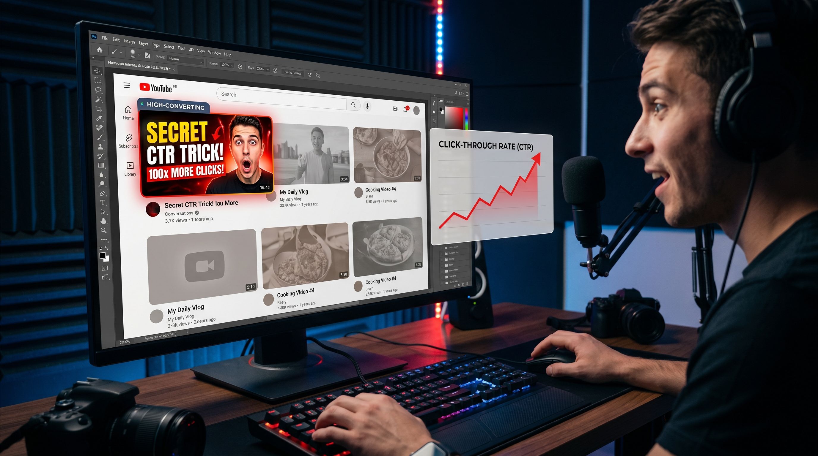
If you're not looking at your click-through rate, you're flying blind. YouTube Studio shows your CTR in the Analytics tab, it tells you what percentage of people who saw your thumbnail actually clicked on your video.
A broad benchmark: anything above 6–8% is generally solid. Below 3% and the thumbnail is probably working against you. But context matters, established channels with loyal audiences will see different numbers than newer ones. Look at your own trend over time, not just a single number.
When a video underperforms, the first thing worth changing is the thumbnail. Swap it, give it two or three weeks, and compare. You don't need a controlled experiment to get useful signal, just consistency in what you change and attention to what follows.
Pay attention to the videos that overperform too. What does that thumbnail do differently? Same question for your worst performers. The answers are sitting there in your own analytics, waiting.
Building a Thumbnail System You Can Actually Maintain
Here's the thing nobody talks about enough: consistency matters as much as quality.
A good thumbnail released every week beats a great thumbnail released whenever inspiration strikes. That means you need a system, not a workflow that depends on motivation.
Create a base template for your channel. Lock in your fonts (pick two, one for big display text, one for supporting copy). Lock in your color palette. Decide on your general composition: where your face usually goes, where the text sits, how much of the frame the background fills. Once that foundation exists, producing each new thumbnail is a matter of swapping content into a proven structure.
This is where something like FileReadyNow's video thumbnail generator actually earns its keep, not for the creative work, but for the production work. When you're on your eighth video of the month and need to move fast, having a system that doesn't require rebuilding from scratch every time is genuinely valuable.
Document what you do. Keep a folder of your best-performing thumbnails. Refer back to them. Let your own data tell you what to repeat.
The Part Most Creators Skip
You can know all of this and still produce mediocre thumbnails. Not because the knowledge is wrong, because designing without feedback is guessing.
The fastest way to improve is to look at your thumbnails alongside the ones outperforming you in the same niche. Not to copy them — to understand what visual problem they're solving that yours isn't. Are they clearer? Higher contrast? More emotionally provocative? Is the face more expressive? Is there better text placement?
Then fix one thing at a time and watch what happens.
Thumbnails aren't magic. They're a craft. And like any craft, you get better by doing them repeatedly, measuring what happens, and adjusting. The creators with the best thumbnails aren't guessing anymore. They built an eye for it, and so can you.
That one image is the difference between a video that spreads and one that sits. Worth the attention.
Frequently Asked Questions
A good video thumbnail is clear, high-contrast, emotionally engaging, and easy to understand at a glance. Strong thumbnails usually include expressive faces, bold readable text, and a clean composition that stands out in a crowded feed.
.The recommended YouTube thumbnail size is 1280 × 720 pixels with a 16:9 aspect ratio. The file should be under 2MB and saved as JPG or PNG for the best quality and compatibility.
Yes. Thumbnails heavily influence click-through rate (CTR), which directly impacts how many people watch your video. Even great content can underperform if the thumbnail fails to grab attention quickly.
Table of Contents
Recent Posts
Retro Revival: Snake Simple Retro Game Review
3 hours ago
Fixed Deposit Calculator: Estimate Your FD Returns in Seconds
7 hours ago
Lumpsum Investment Calculator: Project One-Time Returns Free
7 hours ago
Tung Tung Sahur Trap Maze: A Hilarious Gauntlet of Reflexes
9 hours ago
Dropme Review: A Charming Bubble-Popping Clicker Worth Your Break
10 hours ago
Kick Off Fun with Foot Chinko Soccer
1 day ago